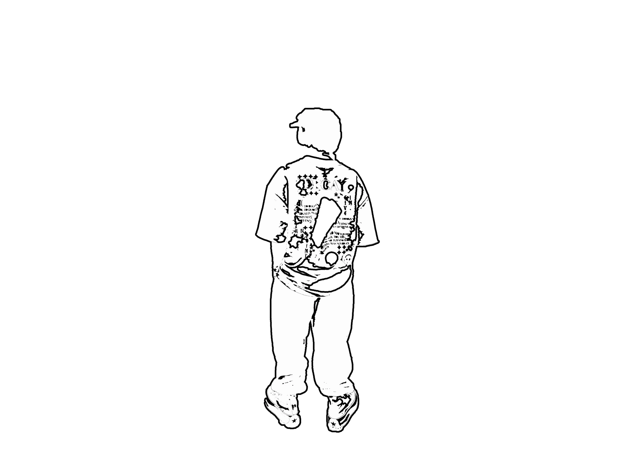
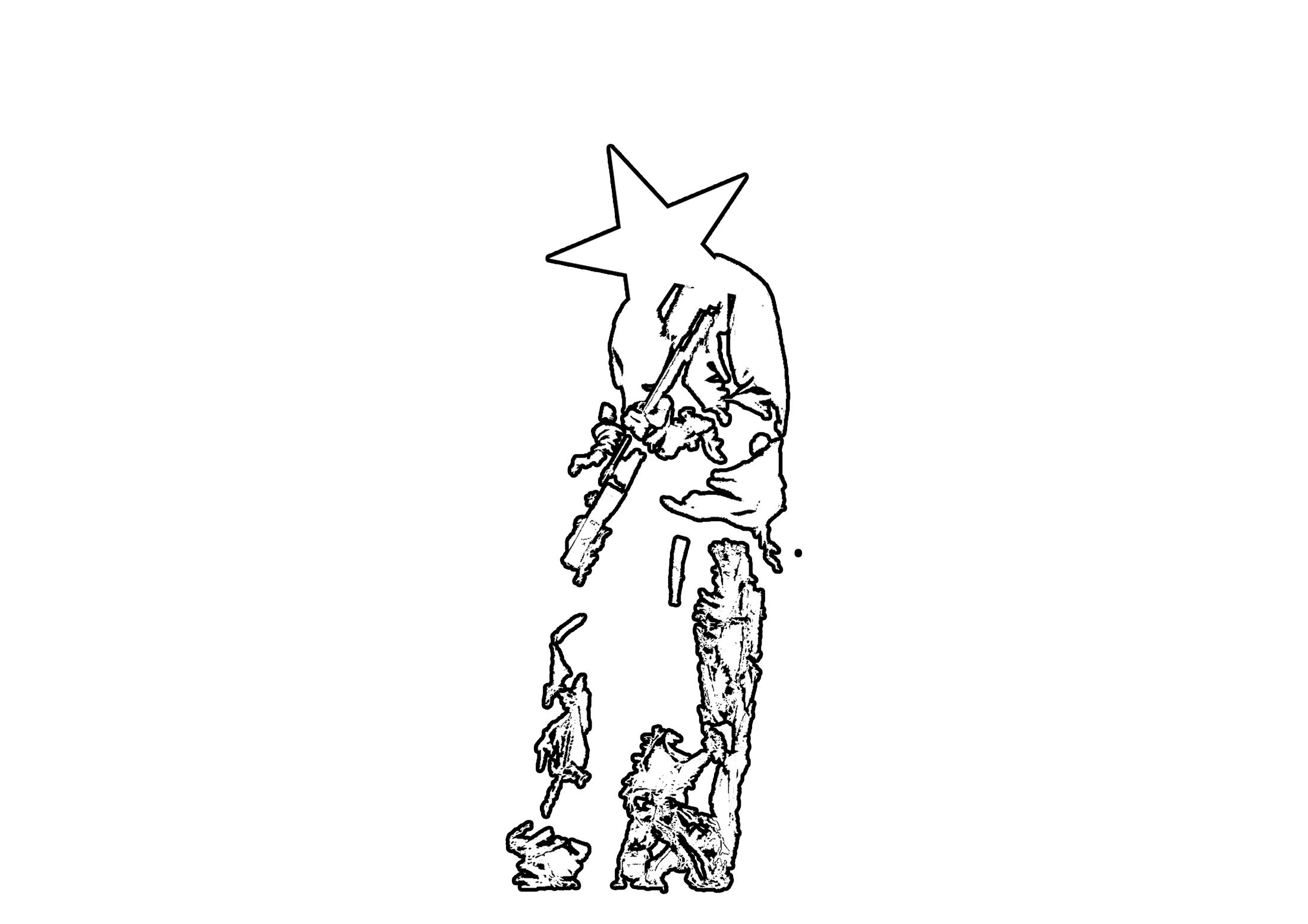
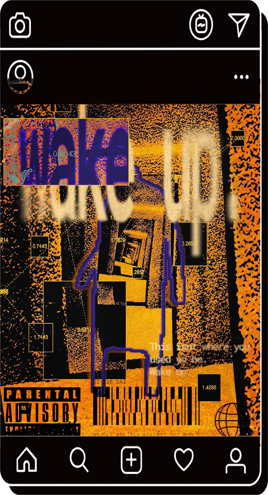
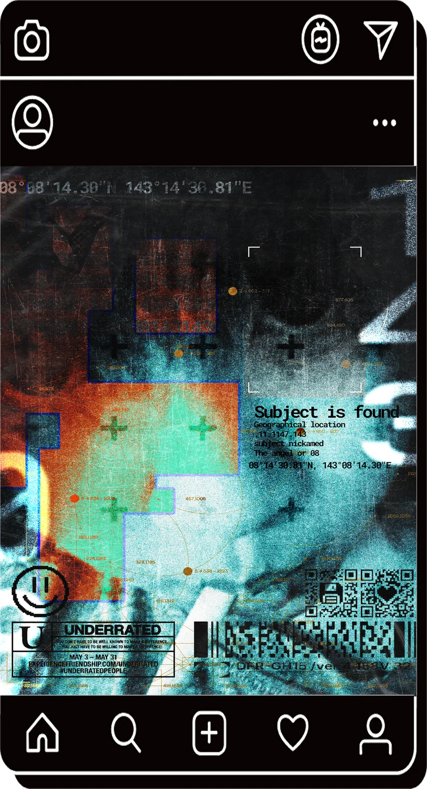
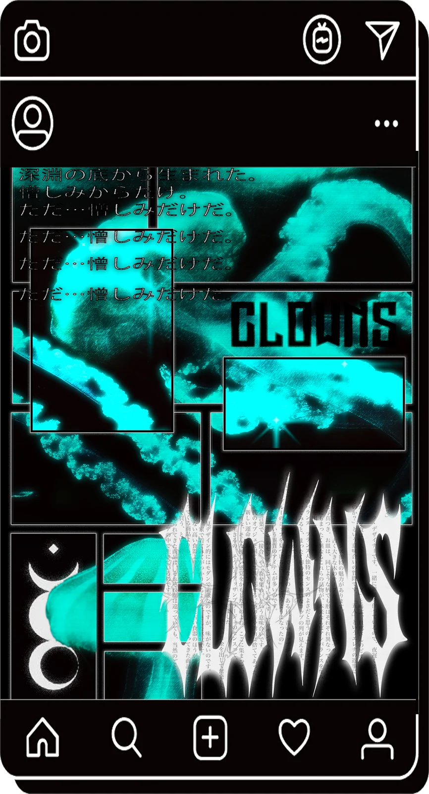
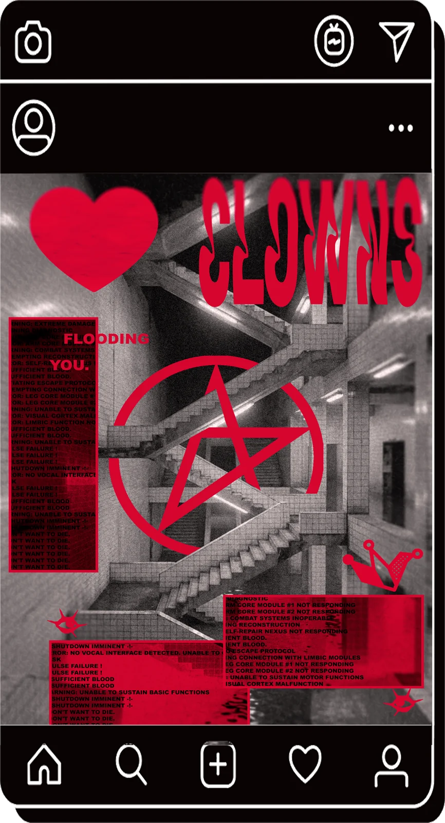
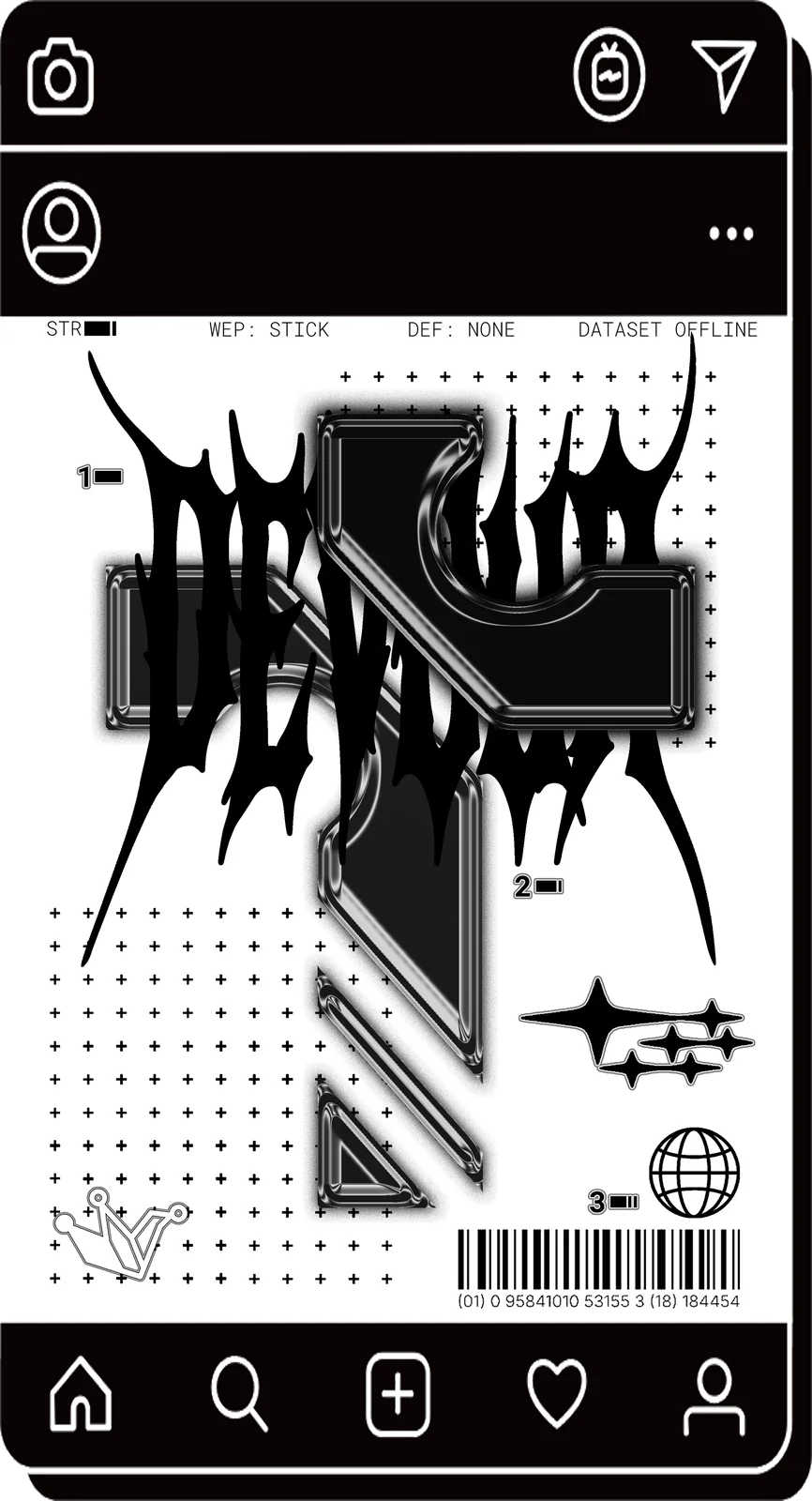
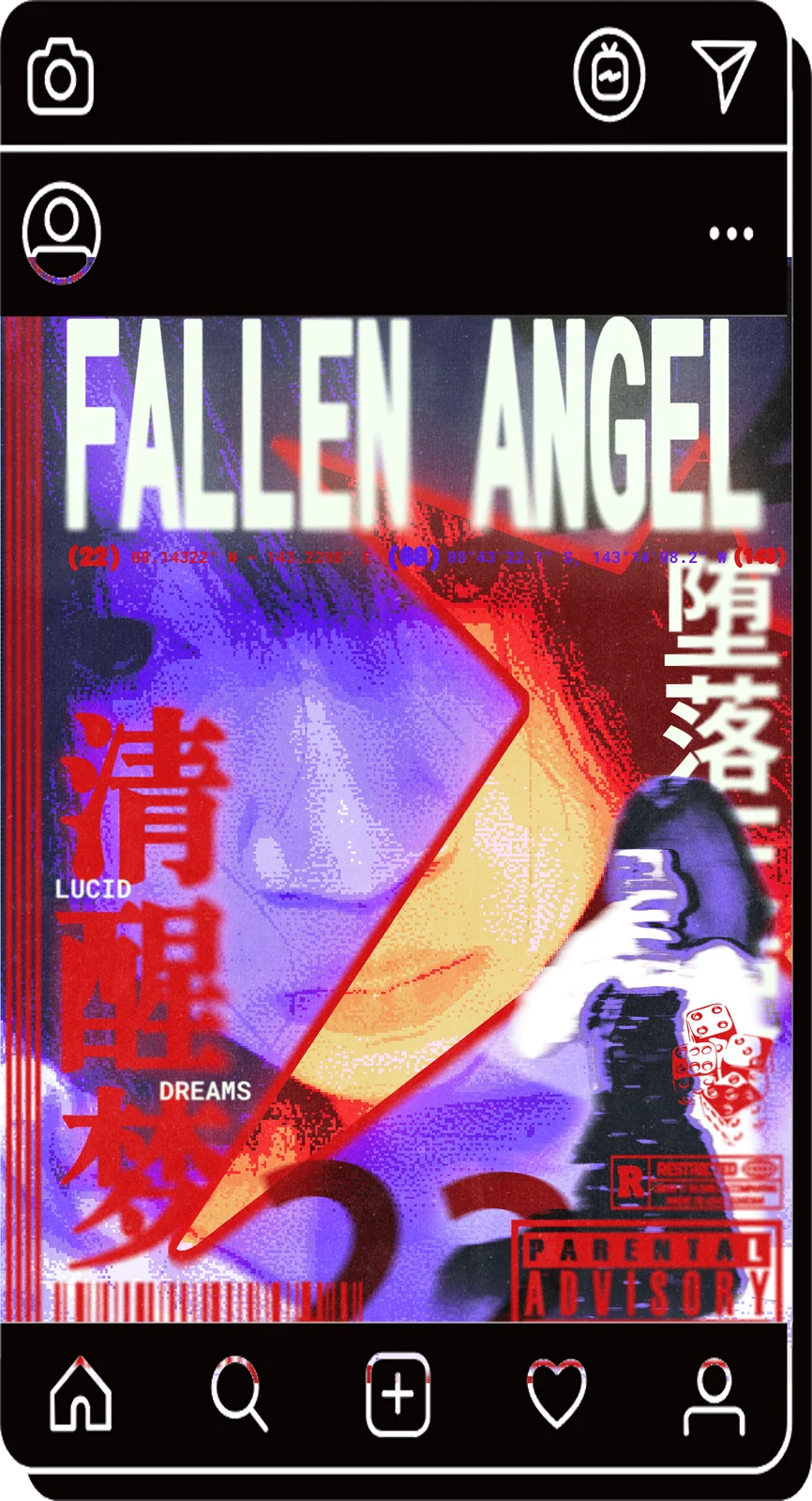
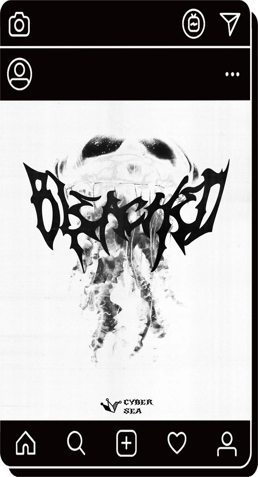
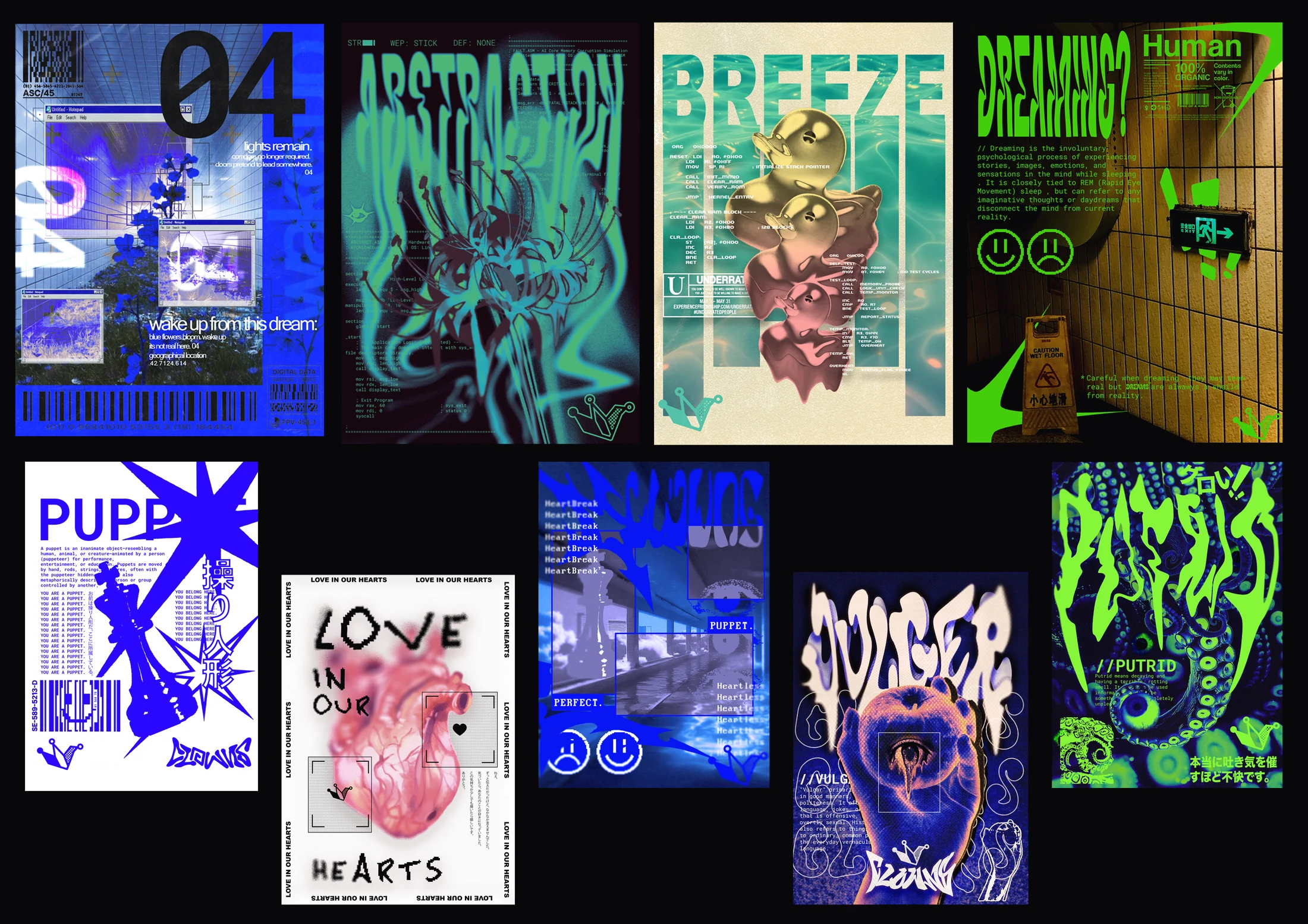
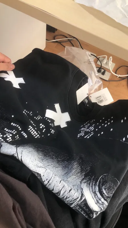
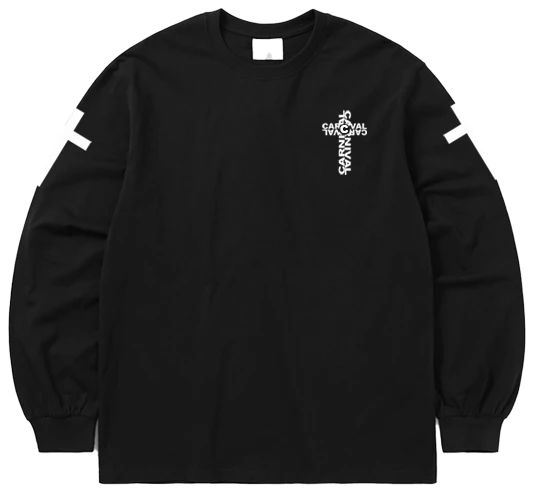
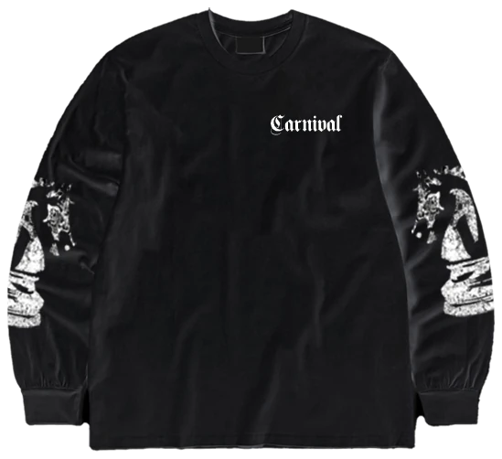
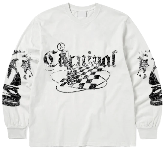
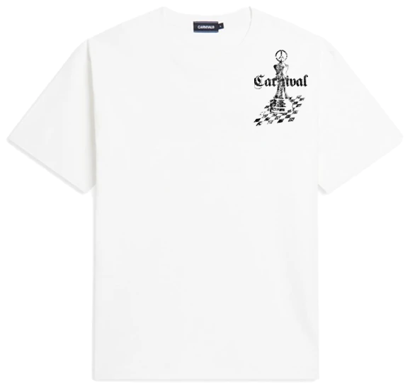
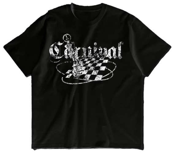
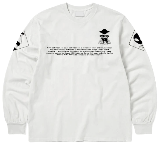
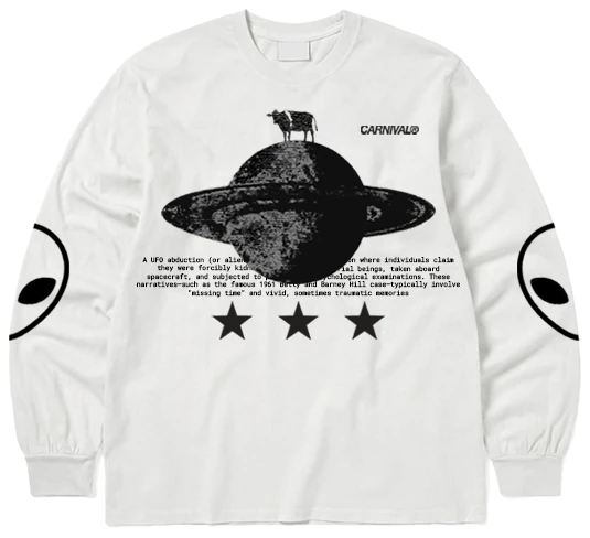
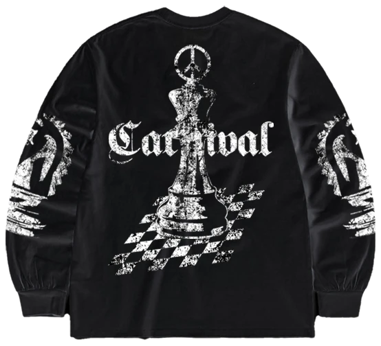
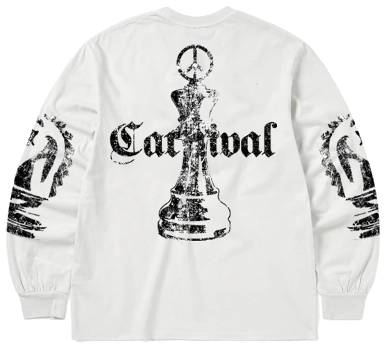
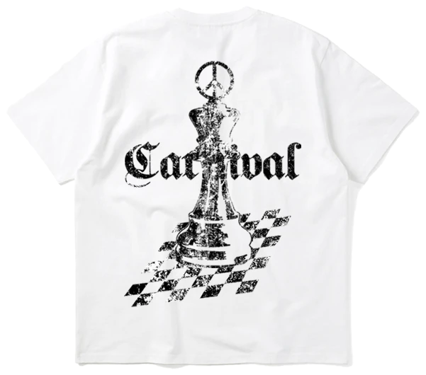
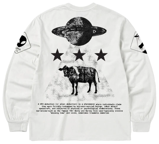
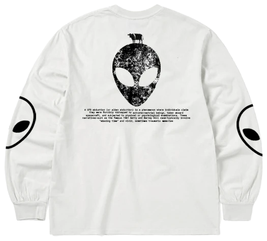
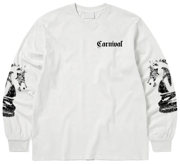
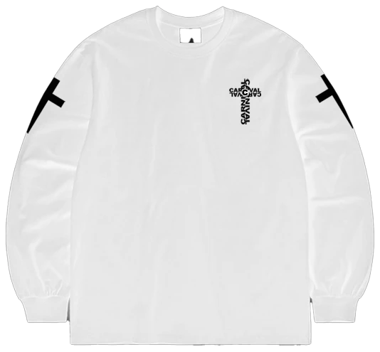
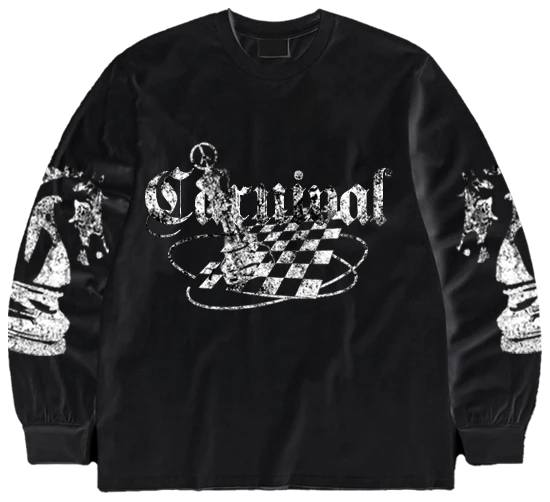
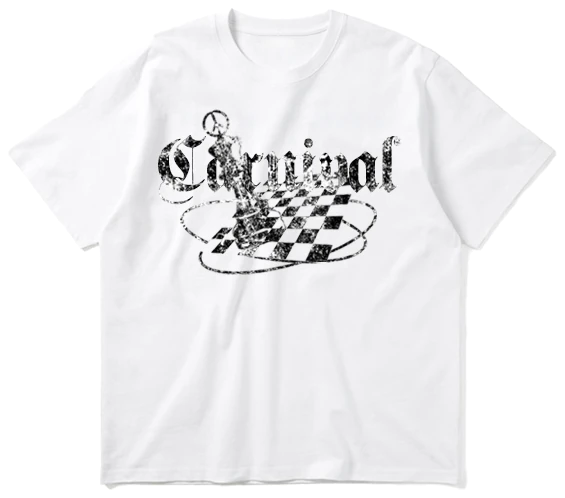
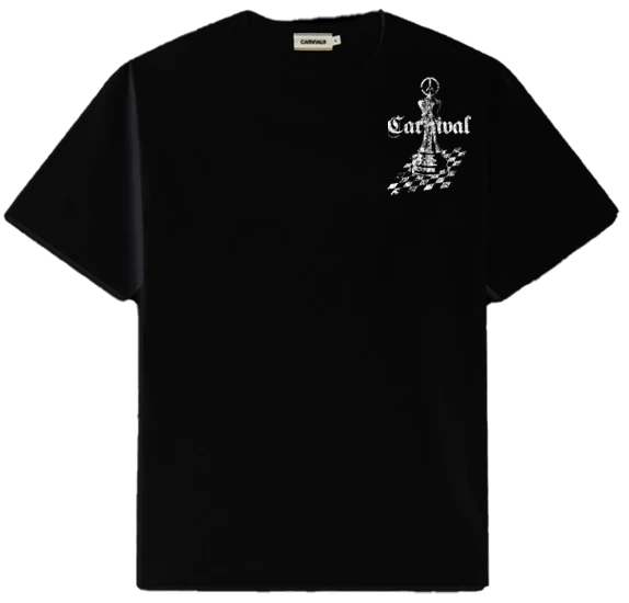
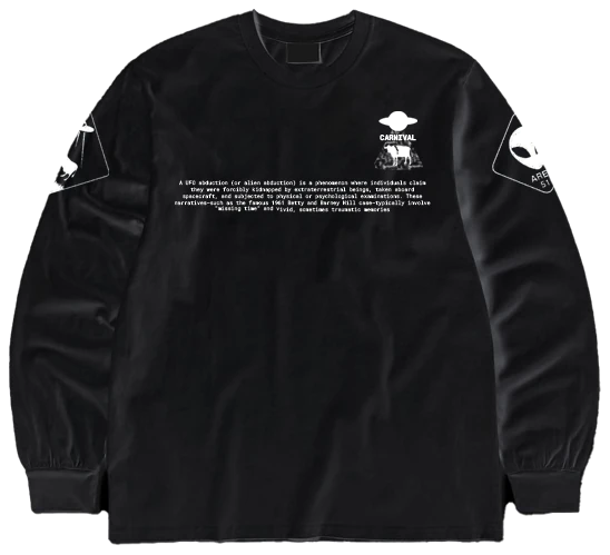
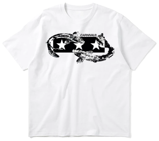
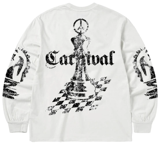
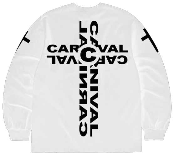
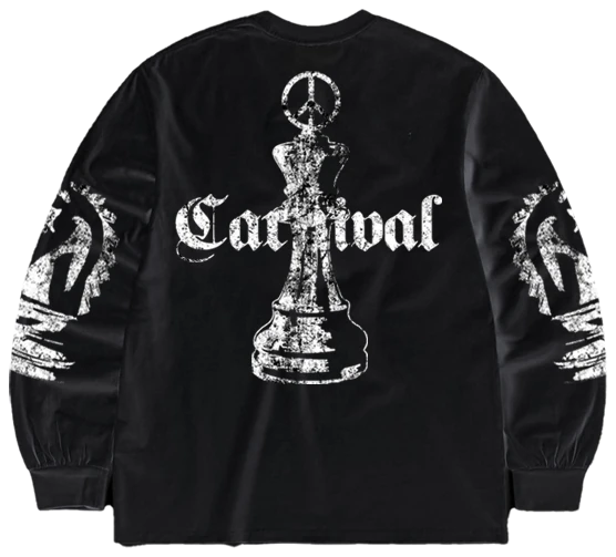
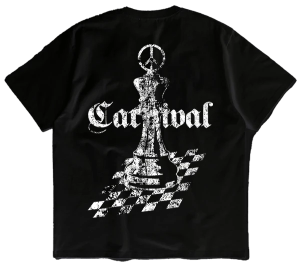
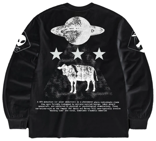
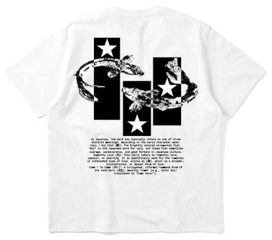
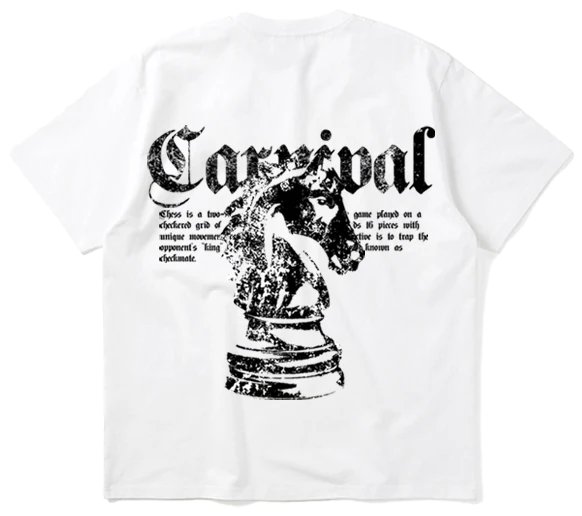
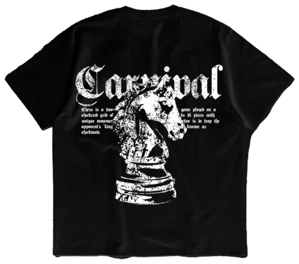
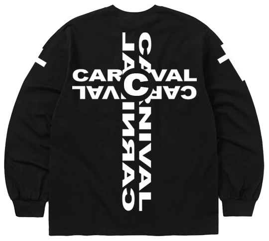
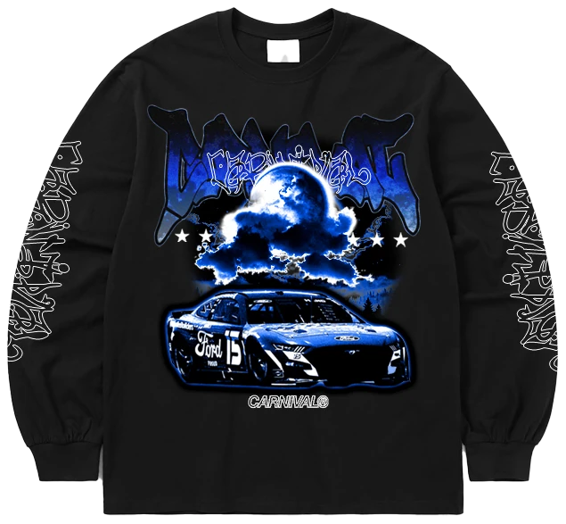
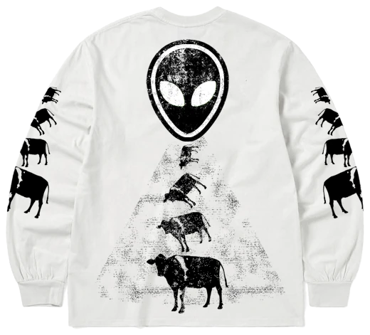
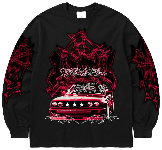
CLOWNS: Brand SummaryBrand Identity: A bold, emerging street fashion label founded in 2025 thatpushes creative boundaries through unique, eye-catching apparel.Track Record: Successfully launched and operated since mid-2025, including a collaborative website build and active engagement at school events.Proven Performance: Achieved significant early traction,generating 24k in profit during the debut sales cycle.Strategic Growth: Currently in an iterative design phase,using data-driven feedback to refine aestheticstyles and identify high-performing trends.Future Vision: Committed to scaling the brand from a grassrootsproject into a recognised mainstream fashion presence.currently collaborating with friends to create awebsite and help with promotion / marketing.
Too many wordssssToo many wordssss
Process / Experience
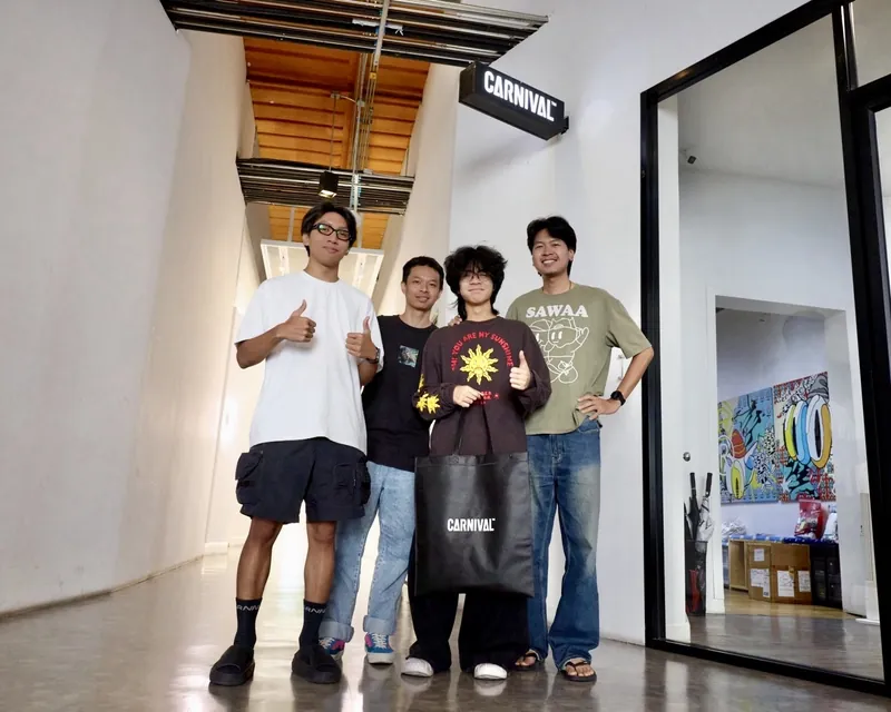
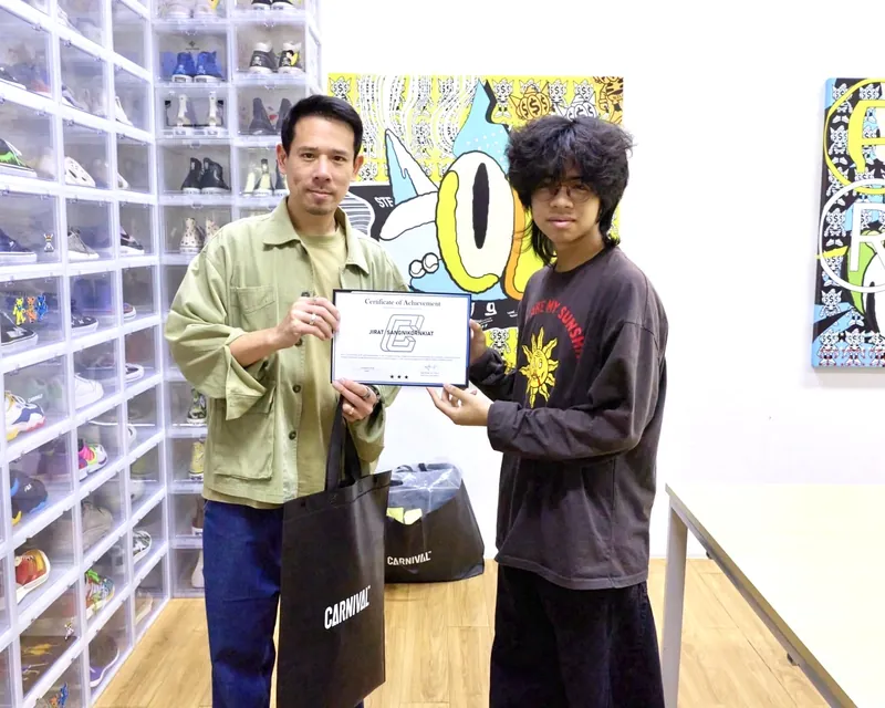
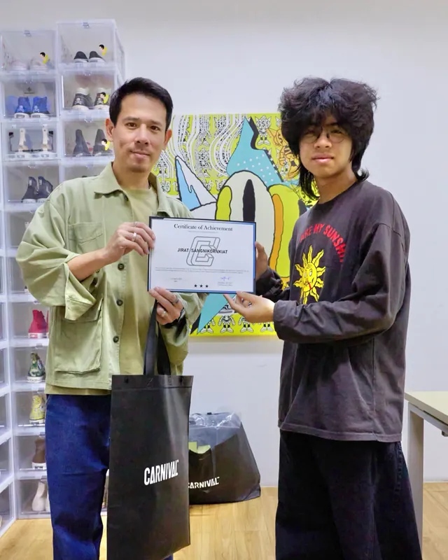
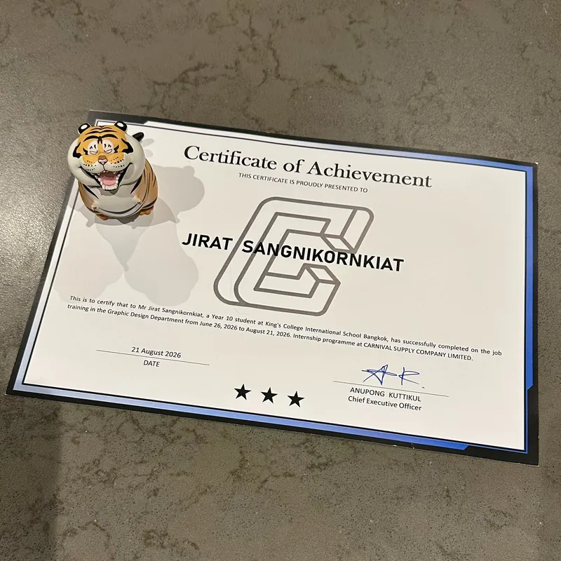
During the time around June to August 21 (2026)i did an internship in a fashion company(CARNIVAL) as a graphic designer for thecompany. i made designs graphics shirtmock-ups and many more logos/elements.The first weeks was pretty challenging as ineeded time to get into a routine of wakingup for me every day (10-4)After a while i really got usedto it and made friends with co-workers making connections withthem. and i got a lot moreefficient at using programs suchas PS and AI than i did beforei started working here. someof my works were alsoused for future designideas as well.Overall it was a greatexperience that wasable to teach andimprove my skills inevery way thanks toall my friends and co-workers.
Art IGCSE
I am also working on my art IGCSE in school as well.I explored the topic of identity for my school igcsethis year and for my theme it started as a shatteredidentity and over time the theme shifts over from thefirst idea to the feeling of “insanity” or the descentinto madness.// Later on this theme was become more a symbolic changethat is physically shown through my works.I aim to display the deterioration of the mind throughexplicit body horror. the more disturbing the body themore deteriorated it is.# My goal is to make people physically feel disgustedwhen they look my work.
Click me fornew angles
Human Flower
sculpture made out of many materials such as foam claychicken wire and a type of wet fast drying clayit was one of the earlier works in this theme based of theidea of a “human flower” opening up the sculpture's face tothe insides showing gruesome and violent imagery of fleshtrying to make a disgusting idea and incorporate it into whatpeople would expect to be beautiful.my goal was to make something “beautifully disgusting”
Click me toview process
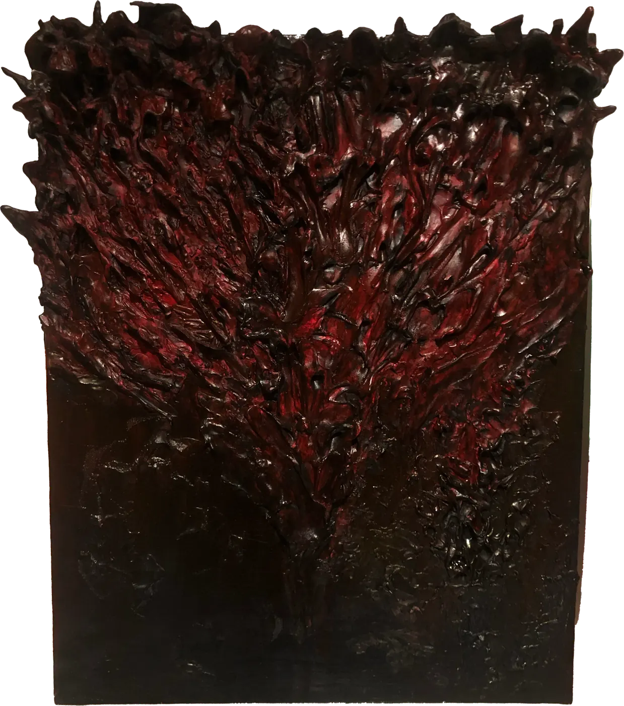
Flesh Wall
Foam clay and acrylic paint on an A3 canvas.Red flesh grows and splatters up from the bottom of thecanvas, as if someone had exploded and plasteredthemselves across the wall.Freshly painted, the red was bright enough to pass forreal blood; as it dried, the colours turned much darker.
Click me toview process
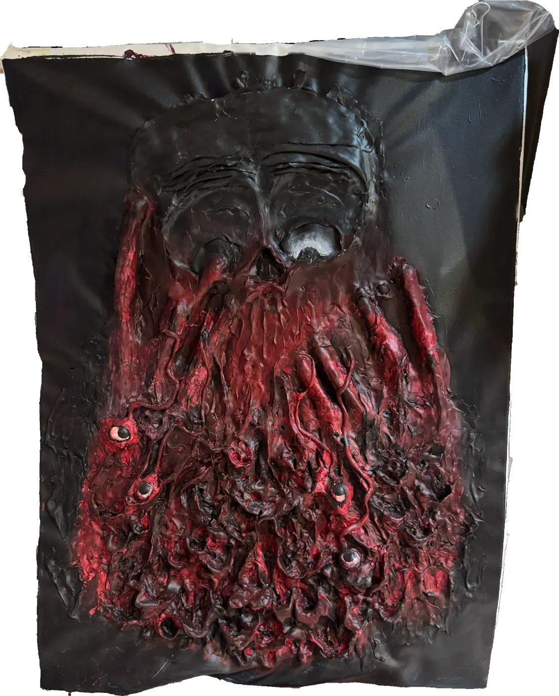
Melter
Made with foam clay and acrylic paint on an A1 canvas 80x60cm.i first sketched out my designs in pencil and then used foam clayto start building my facial structure and after i was happy withthe face and hands i used grey acrylic paint to make the faceand hands then covered it all in red.my aim for this piece was to capture the feeling of slowly meltinginto an abomination over time trying to hold yourself togetheras you inevitably melt into insanity.this piece is actually still unfinished as i will add a gildedframe around it and add more melting flesh over the frame.
Work in progress
Click me toview process
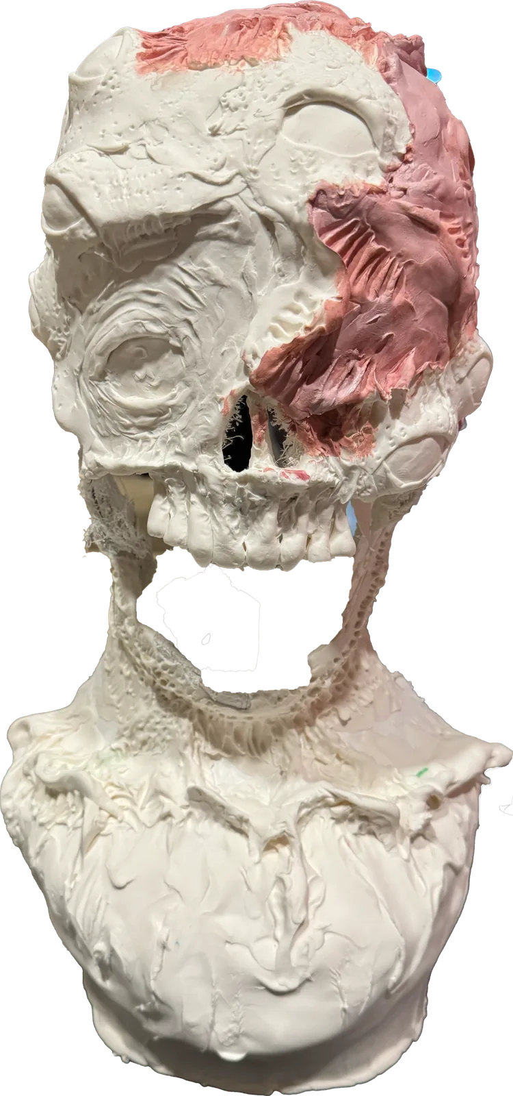
Abomination
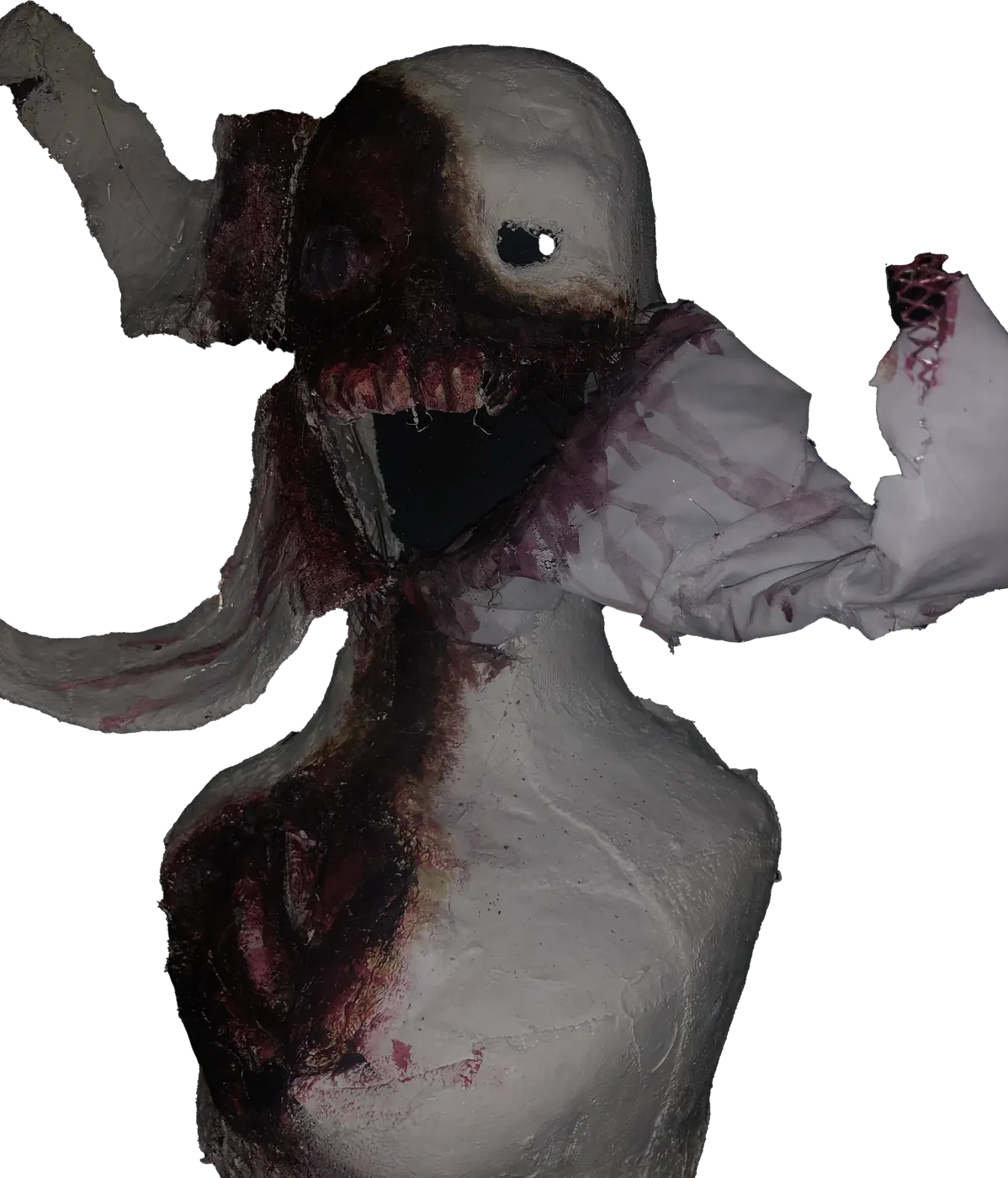
Made with foam clay and acrylic paint on a mannequin head.Changing from the first idea of the human flower the sculptureitself gave the feeling of “dead” looking due to the darker burnedcolours so this time i turned the approach to making the sculptureinto a living abomination that is fleshy and red as if existingis already painful.With distorted facial features such as eyes in the wrong places andhaving multiple eyes and a broken elongated jaw that rips downwardsand textures that make people feel uncomfortable to look at thispiece aims to make people feel sorry but too scared toapproach the amalgamation.
Projects // Achievements
F1
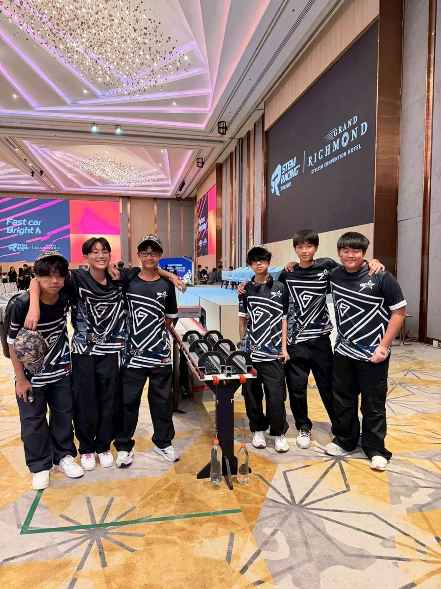
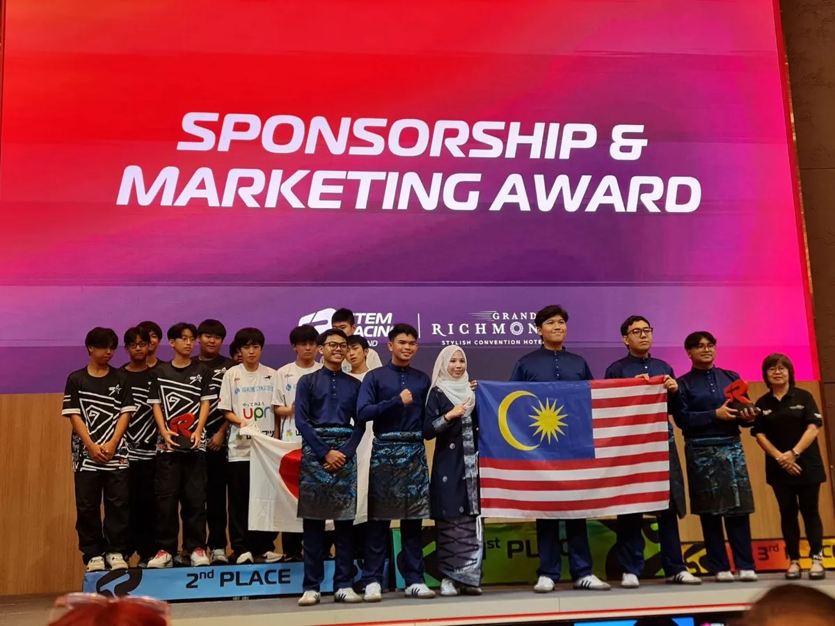
STEM RACING THAILANDNATIONAL FINAL
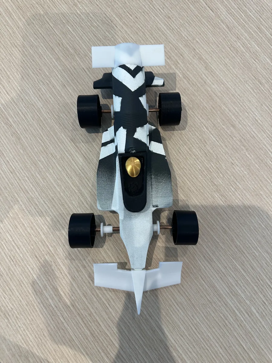
// Around the year 24-25 i was working ina group project known as “F1-RACING” in which i worked as the team graphic designer.My role was to create designs to representthe team on the race tracks as well as directparts of the aesthetics of our F1 car.Our team name was called “AETHER RACING”
// We also set out to earn many sponsors suchas WAIWAI instant noodles andCARNIVAL (a street fashion brand) to supportour journey during our time in this project.(goal was roughly 500K bht of sponsor funding)
POOLROOMS
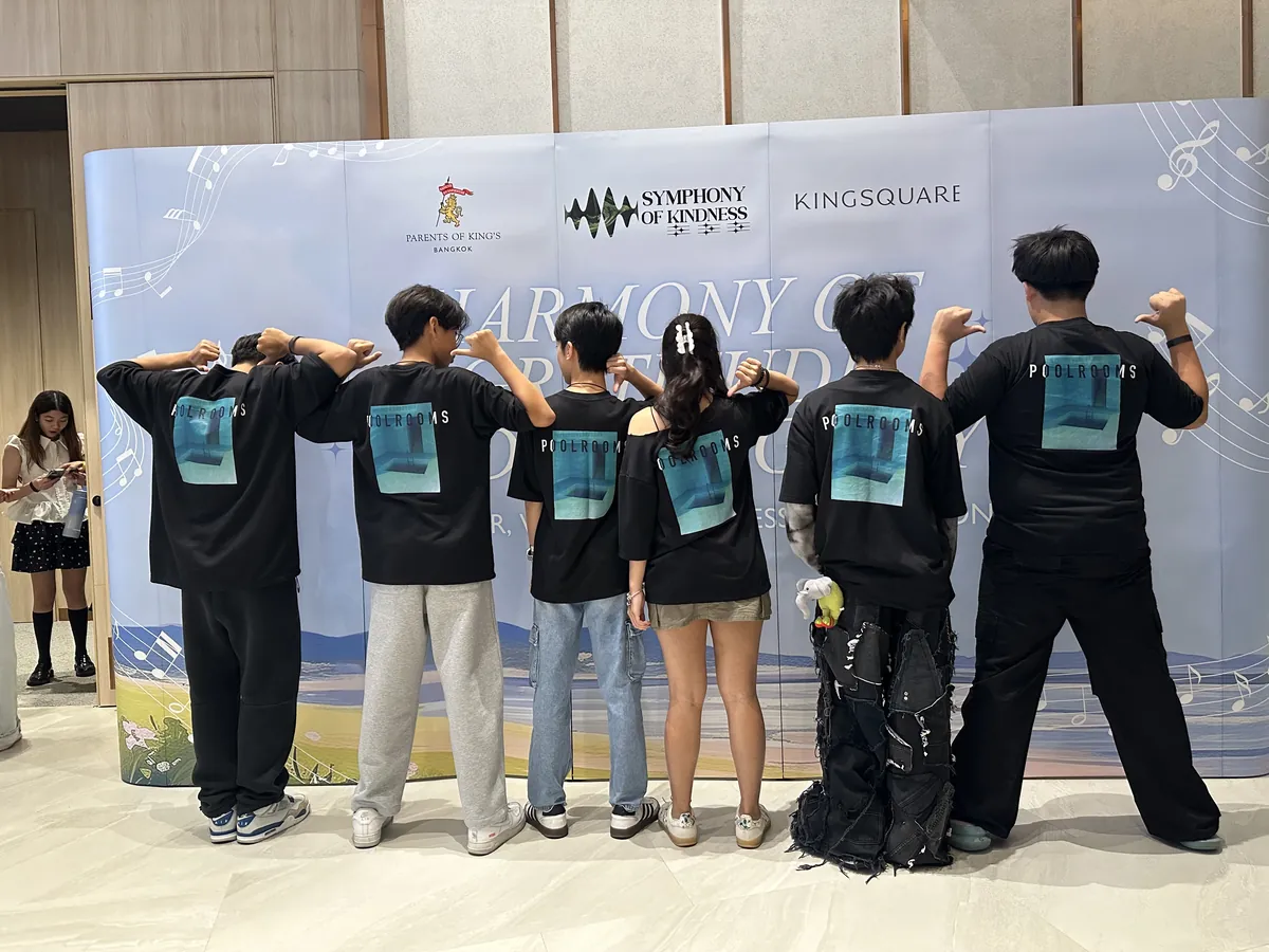
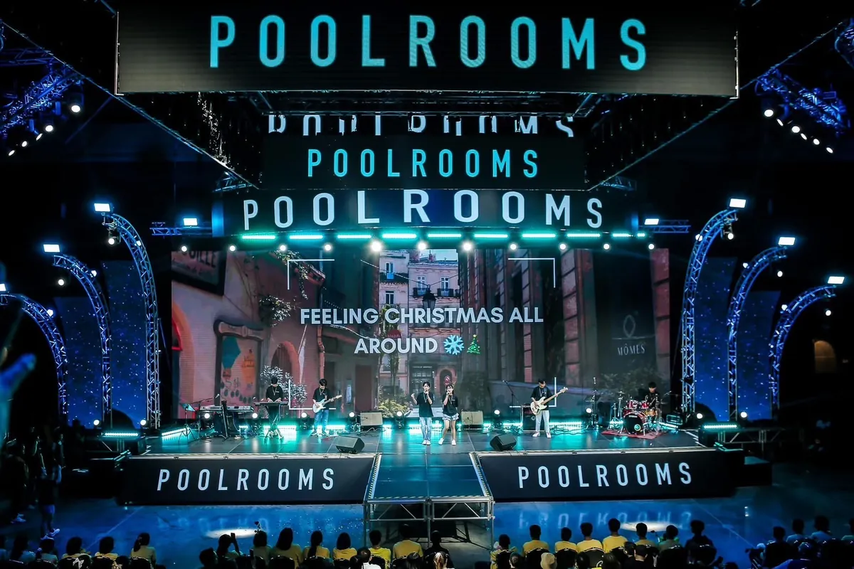
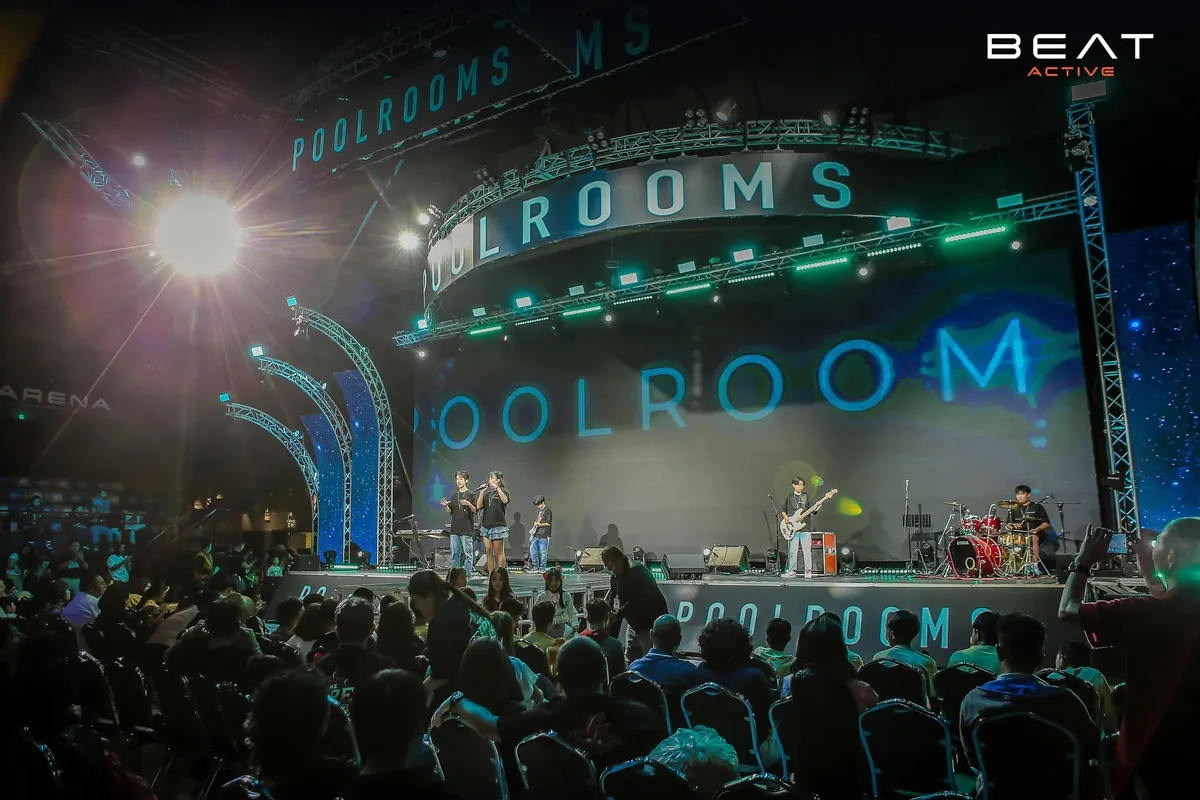
// I was in my school band called “POOLROOMS”and I was also the one who designed the shirtfor my band.
// This design was made on Procreate inspiredby the “POOLROOMS” from the backrooms.
SYMPHONY OFKINDNESS
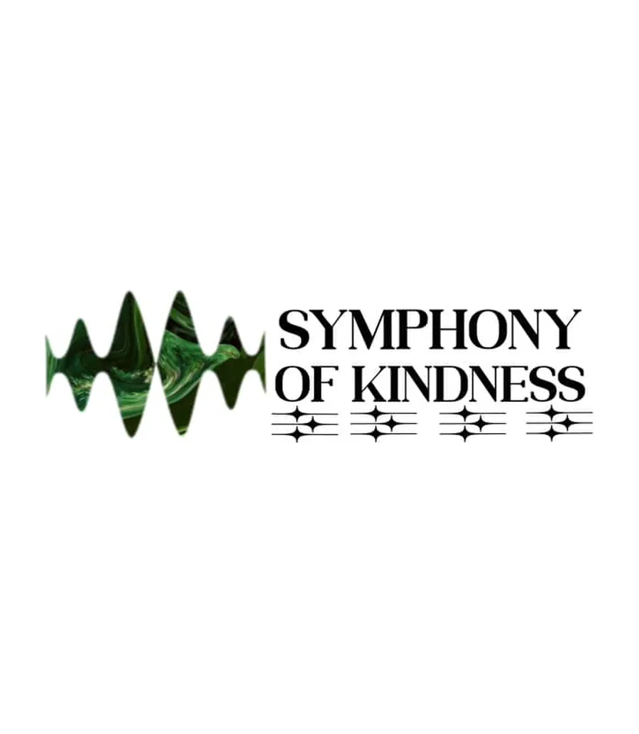
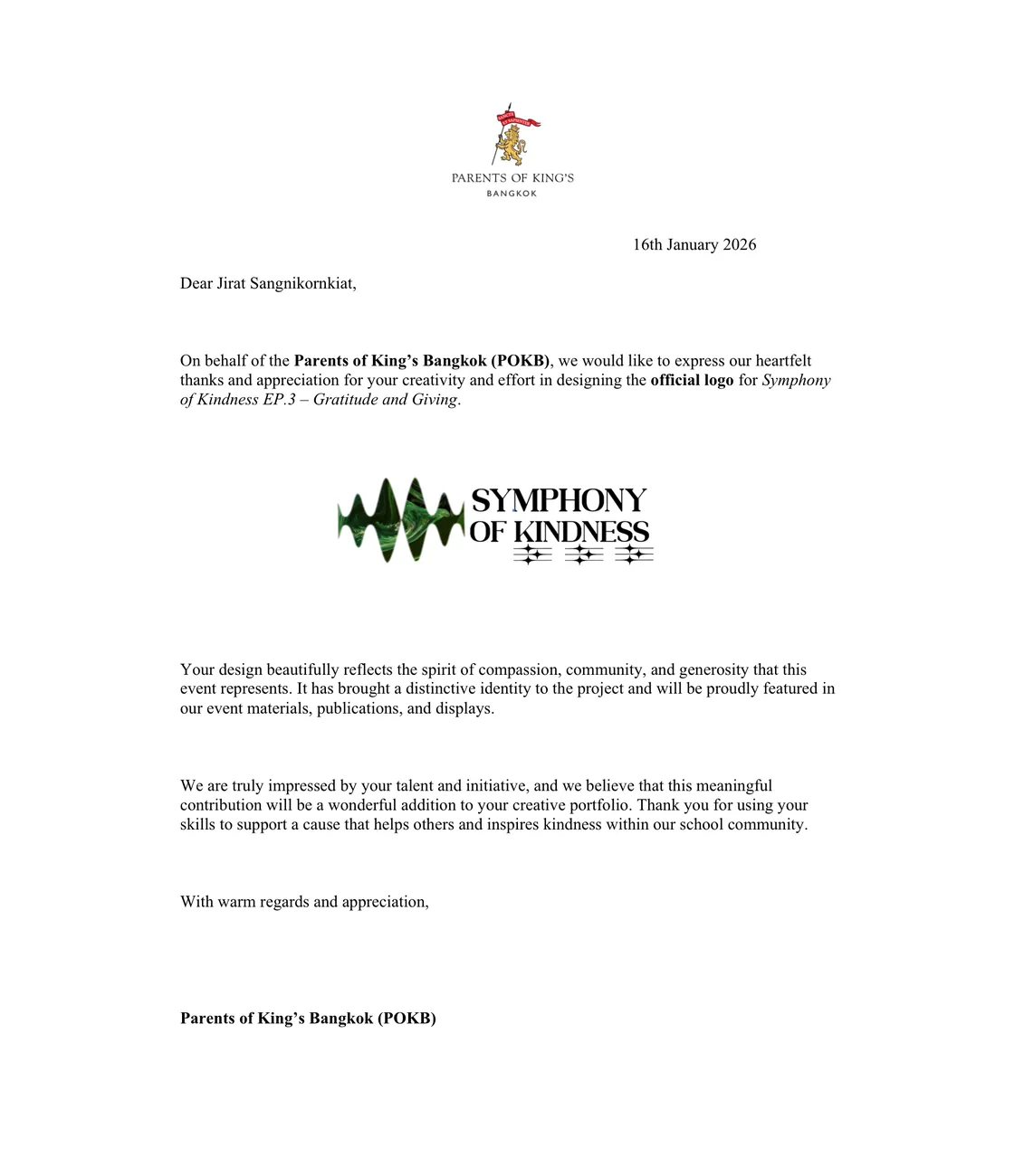
// around last year for my school charity myband played at the “symphony of kindness”charity that the school made and they requestedfor me to remake the charity logo for them.the logo is now been used for the past year andwill be used for the future as well and i amproud to be a part of the charity and to bethe designer of the symphony of kindness logo.